What makes some photos stand out from others? What makes compelling photos pop off the page?
Multiple types of contrast have the power to take photography — especially food photography — to the next level. Variations in lighting, color, composition, and texture help your photos stand out. And it’s these considerations that we take into account when planning a photoshoot here at Food Photo Studio.
This month’s post is an inside look at some of the details we keep in mind. Read on to learn more about contrast!
So, What Is Contrast in Photography?
Before we cover all the types of contrast, let’s first define what contrast is. Contrast simply means showing differences between the variables that come together to create an image. Sometimes these are slight differences, and other times they are more strongly opposed.
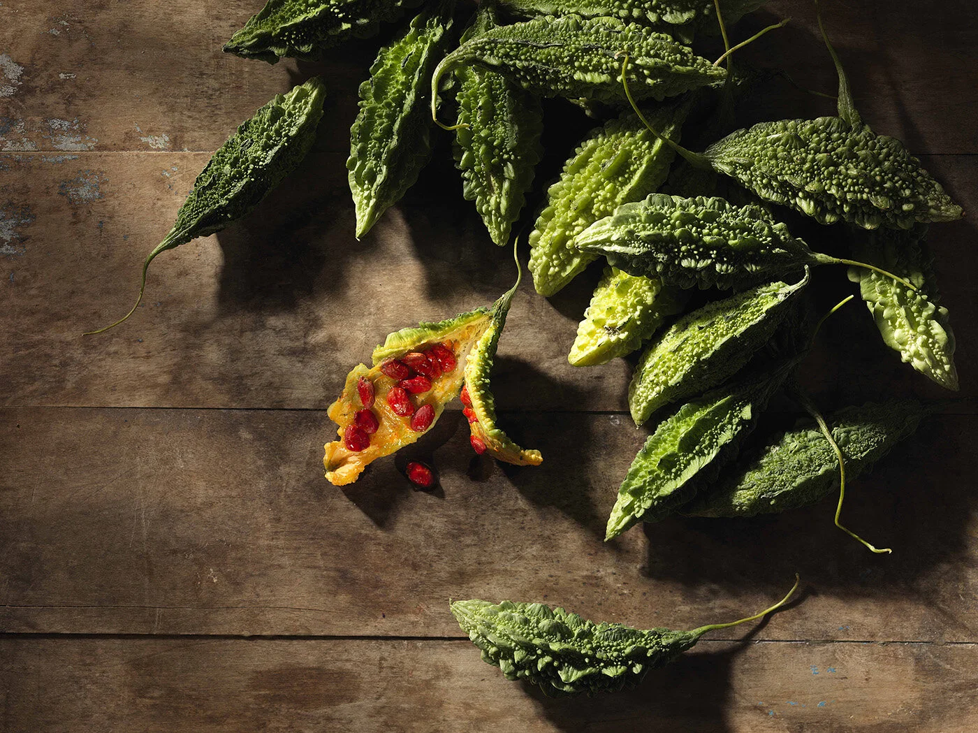
This is easiest to demonstrate with color. For example, white and black next to each other have a higher contrast than several shades of mid-tone gray. Or typically blue and orange have a higher contrast than blue and purple because they oppose each other on the color wheel.


However, there are other forms of contrast that are often overlooked in photography, such as texture (rough and smooth) and composition (activation of negative space). Each of these areas work together to provide varying levels of contrast, creating a more interesting image.
4 Types of Contrast in Food Photography
Contrast in lighting and tone
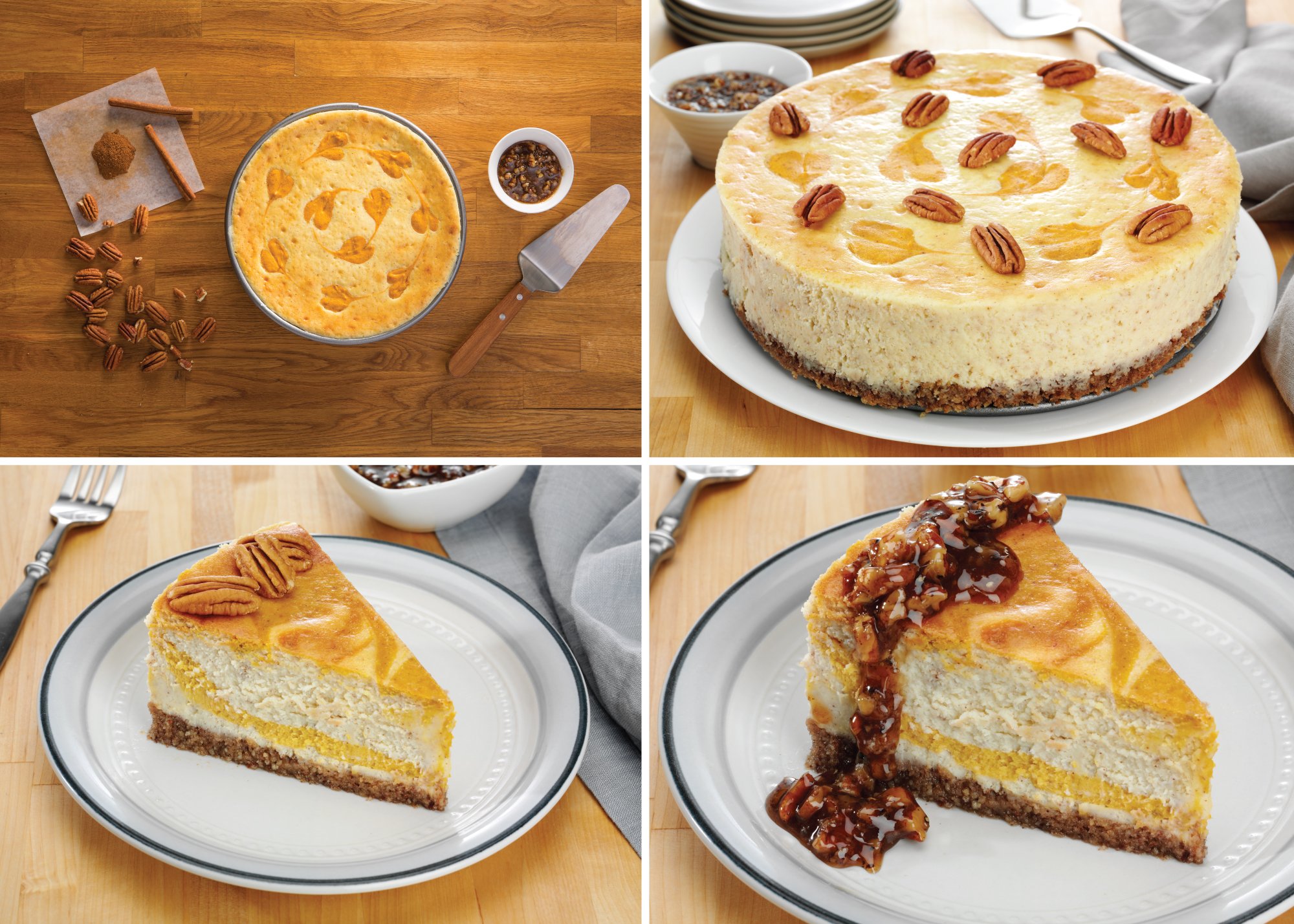
Perhaps the foundation of contrast comes when considering the lighting of a scene, creating a range of light and dark tones. Higher contrast images are a result of brighter white and darker black tones. The farther an image’s values get from each other in tone, the higher the contrast. Lower contrast images are created using an opposite technique, making sure there are a lot more midtones with varying shades of gray.
To help us choose which direction to go, we think about the mood of our client’s brand and the feeling they want to exude to consumers. We use different lighting techniques to make this happen. For example, we often use high-key lighting if we want an image with intense contrast and more even lighting if we are looking to soften the relationship between the tones.


Color contrast
Color contrast is a great next step when incorporating contrast, and it’s a fun way to test your color wheel knowledge. For the most color contrast, think of the colors across from each other on the color wheel: red and green, orange and blue, yellow and purple. These color relationships are best to begin.


Combined with variations on lighting and tone, you can play with both subtle and striking color relationships in food photo imagery, like monochromatic (tints and shades of the same hue, as in the various pinks in the berry oatmeal example above) or analogous colors (three hues next to each other on the color wheel). In food photography, the choices of how color is used is also in line with a brand’s style and mood, and emphasized by the props we choose to go in the scene.
Contrast in composition
Once we have the lighting and color decided, we choose the details in a set up that will further underscore contrast. For composition, this can include using the negative space to our advantage — creating something that is either very minimal or fills the frame.

Texture contrast
Finally, the textures in the frame are where the details really shine. Prop choices such as table decor, napkins, and garnishes can provide contrasting textures (hard vs soft, sharp vs rounded) and create a more interesting image. In food photography, you can also show foods that are known to be contrasting in flavor (salty vs sweet, juicy vs dry), as well as prepared foods in contrast with their raw ingredients.

The Bottom Line: Contrast Is Key in Food Product Photography
From the backdrop to the lighting set up, and the color prop textures to the food itself, every piece we include in a scene is intentional and contributes to this process. Contrast is one of the tools in our toolbelt we use to bring our clients’ creative ideas to life.